Build your agent
Appearance
Colours, dark mode, animated launchers, position and size — with a live preview.
The Appearance tab controls how the widget looks on your site; the live preview on the right updates as you type.
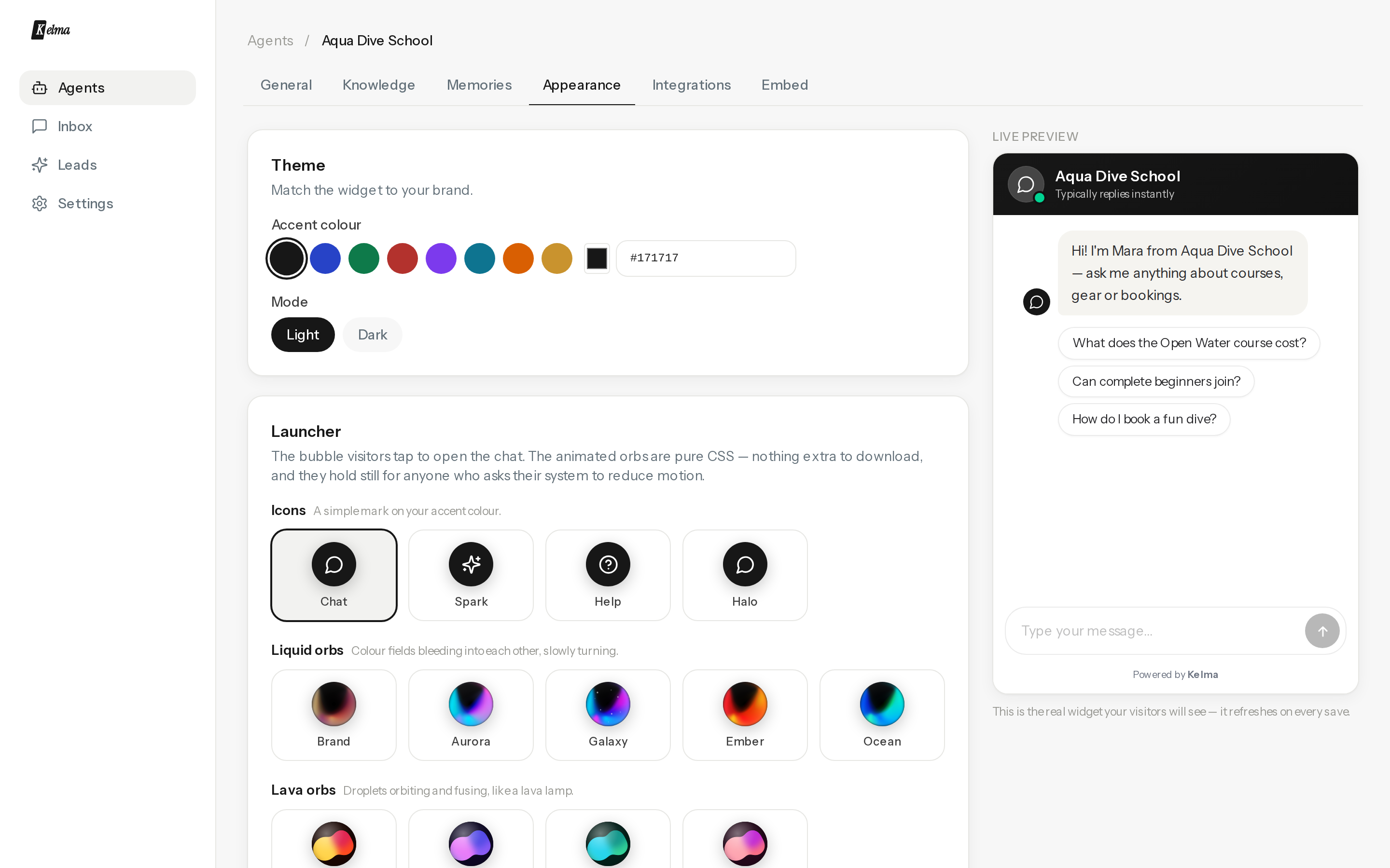
- Accent colour — any hex; buttons, visitor bubbles and the launcher follow it.
- Light / dark — match your site's theme.
- Launcher — three families: Icons (classic glyphs), Liquid orbs (slow-blending colour orbs; Brand derives its palette from your accent colour), and Lava orbs (blobs that fuse and split like a lava lamp). All pure CSS, all respect visitors' reduced-motion settings.
- Position & size — bottom-right or bottom-left; launcher 40–80 px; panel width and height for desktop. On phones the chat always opens fullscreen.
- Welcome bubble — a small teaser next to the launcher before the first open.
Per-page overrides are available on the embed snippet (data-color, data-position, data-size…) — see Embedding.